Why can I not get used to Android’s gesture navigation? Why have I still been using 2-button navigation up until AOSP broke it? And why does gesture navigation actually perform worse in terms of user experience?
Well, I haven’t been able to run a proper user study on it yet, but in short, interactions that require user input delay are bad.
If you ever work in UI/UX, please NEVER use speed of interaction or timing delay as an input. You should never assume the speed at which users should be required to interact.
So, why does Android’s gesture navigation suck in particular? It’s because viewing the application switcher requires an indeterminate delay in user input.
As a refresher, here are the system navigation options, in order: Three Button, Two Button, and Gesture.
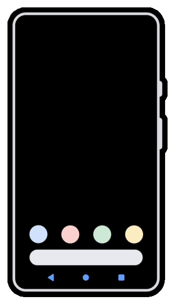
For gesture navigation notice specifically the part:
Swipe up and hold to view recent apps
And note how this causes many usability frustrations when you want to be fast:
- If you don’t hold long enough, you’re sent back to the home screen
- There’s no binary indication when you can stop holding
- (You can configure a vibration when the timeout completes, but vibration is not acceptable as an only means, devices may not have it in hardware or turned on)
- The only indication of “action complete” is when another app shows up from the left: this is not binary as the animation is not at all aligned with when the action timeout is reached
- There’s no option to change the timeout: you are forced to be “average” in terms of human speed
- Faster users or powerusers are now slower to switch apps
- Slower users must “get good”, and must speed up for accurate inputs
And if you’re slow:
- Choosing between “home” and “switcher” actions takes planning or unnecessary familiarity (have you ever seen a new smartphone user try gesture nav?)
- Older or less physically speedy users will often accidentally trigger switcher when intending for home.
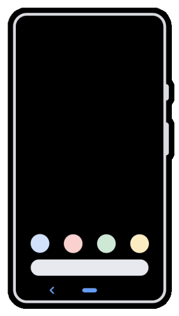
Why did 2 button navigation still work?
Because it didn’t rely on time as an input factor:
- Home: touch and release
- Switcher: touch and slide up
Note that neither of those actions depends on timing in any way, it starts on press down, as soon as the finger either moves or leaves the screen the input is registered and the action is known.
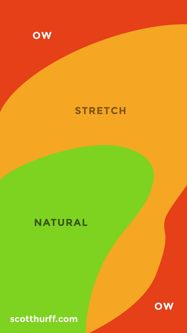
Why 2 buttons instead of 3?
3 button navigation always placed one of the 3 Android navigation actions in a “no-good” touch zone of a mobile phone’s display.1 Even one of the 3 extremely commonly used navigation actions being in a bad spot hinders the accessibility.
With 2-button, all three navigation actions could be located within the comfort range of a user’s thumb, which is even more important as phone screen sizes keep increasing, which I also do not like, but that’s a different issue.
Thanks to Scott Hurff’s templates we can see exactly how these navigation UIs fit (or don’t) into the comfortable thumb zones:

Why don’t more people care?
There’s been plenty of research into humans waiting for computers,2 however most of this research is behind waiting on the computer, and does not really cover the case when users are actively interacting like having a finger moving across the screen.
Users have gone from waiting on the computer to being forced to wait by the computer.
While many people won’t consciously notice, we already have interfaces like Zed and Alacritty that are advertising their response latency in milliseconds. Real humans can feel the difference3 already below a hundred milliseconds, but often can’t immediately explain why a system might feel slow. Mis-inputs due to timing, such as not holding long enough, are normally just subtle frustrations and rarely are ever annoying enough to interrupt whatever the user was trying to do.
Modern software development has simply gotten used to trying to find a “middle ground” for these timing-based actions, as they attempt to choose a suitable timeout delay or hold length that is comfortable for the average person. Most of the time they never thought about doing away with the interaction entirely and replacing it with something that didn’t depend on timing, and to be honest sometimes that is a challenging problem: I think we need more research into this topic, but I am no expert in designing graphical user interfaces.
Why write this post?
To answer the question at the beginning:
Why can I not get used to Android’s gesture navigation?
When AOSP / Google broke the 2-button navigation I had been using, I switched to gesture nav thinking it shouldn’t be too difficult to switch, but I was wrong. Immediately after switching I noticed how often I would swipe too fast and end up “pressing the home button” instead. This got really annoying very quickly and forced me back to 3-button for the time, which has it’s own problems I wrote about above. (Especially on the Motorola Edge, which has a giant screen and extreme edge curves, making the other navigation experiences even worse.)
Now I’m stuck, with some devices using 3-button, some using gesture navigation, and only my old, outdated, and insecure devices remain with the good old 2-button navigation that I miss. I absolutely intend to reference this post in the future, but all I really want is my old navigation back.
What about iOS?
- iOS doesn’t even have the option to change navigation styles!
- “Reduce motion” accessibility option doesn’t speed anything up or get rid of transitions, it just replaces them with fade in/out, which makes it even more difficult for me to tell how the transition is progressing.
Although I have not tested this myself, Apple’s site notes that iPad navigation is the same gesture controls as the iPhone, but I’m assuming this is the same situation that an Android tablet would have: a lack of haptic feedback. Without this feedback the app switcher requires indeterminate delays and thus I think contributes to a poor user experience.
Other related problems
Gnome Shell and animation speed
The whole reason behind why the Gnome Shell Impatience extension exists is because the default animation speed was too slow for speedy users.
This is one half of the issue with Android gesture navigation, where only the faster users are affected: speedy users must wait for the animation to complete before new inputs can be accepted.
Android’s case is worse, because it applies to both slower and faster users.
High-latency mouse movement or remote desktop
While high latency alone is not often enough to cause the same issue as Android has, adding jitter results in a very similar problem. With a jittery connection the timing factor is again indeterminate, as in, “how long do you wait for the mouse to stop moving?”
Many remote desktop clients don’t give you any feedback about inputs that are in-flight to the remote end, just as the Android gesture navigation doesn’t give you any feedback about how long you’ve waited for the gesture action to change from ‘home’ to ‘app switcher’.
To prove my point that they are similar issues, notice how the high jitter connection also affects both the speedy users and the less acclimated users: speedy users must wait for the system’s delay, and less accurate or acclimated users must spend additional effort re-positioning the mouse when they don’t get the movement or input right the first time.
I suggest that both Android gesture navigation and distant remote desktop connections suffer from human-indeterminate delays, which I personally find to be extremely annoying and frustrating compared to other UI/UX shortcomings.
Both situations can be improved simply by giving the human operator a clear and obvious indication of the event timing. (When the action timeout occurs for Android, and when all inputs have been processed on the other end for remote desktop)
Double-click to open
During a conversation on this topic I was asked whether “double click” as a standard user input action fits into this category, and that made me realize I had been avoiding “double click” as well without realizing that it’s the same problem of user input requiring indeterminate timing. In my personal workflow I don’t normally use double click for anything, and in places like my file explorer (Nautilus) I’ve had the “open” action set to single click since I was a child.
To be clear, “double click” absolutely is afflicted by the indeterminate timing problem. This can be easily shown to be a poor experience for both the speedy (clicked twice too fast) and the slower users (didn’t click fast enough), however most computer users I know simply got used to it after a short amount time.
Since the failure to execute a double click (just clicking to select a file or focus a window) is basically harmless, nobody cares very much. Imagine if the single click action on a window’s title bar was “minimize” while double click remained “maximize”, people would absolutely call out the poor user experience. Just because someone is used to something doesn’t mean it’s the best option.
Footnotes
A site being listed here does not mean I think it’s a great site, just that it is relevant and might have useful information if you are looking for more.
I suggest using a tool like Privacy Badger, and you might want to use an adblocker.
-
Humans waiting on slow computers
- SE post about long or unnatural delays ux.stackexchange.com/questions/82485/whats-the-longest-acceptable-delay-before-an-interaction-starts-to-feel-unnatur
- “Handling Delays” www.uxmatters.com/mt/archives/2018/07/handling-delays.php
- “Response Times” www.humanfactors.com/newsletters/response_times.asp
-
Measurable and perceptible delays in user interaction lead to a difficult-to-diagnose and worse experience
- Typometer: a tool to measure visual latency from text editors pavelfatin.com/typometer/
- CHI15 paper on touch latency: www.tactuallabs.com/papers/howMuchFasterIsFastEnoughCHI15.pdf
- Dan Luu’s blog post about input latency: danluu.com/input-lag/